Twitter Re-Design
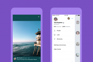
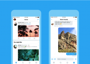
Twitter is looking a lot different, it’s more unified, profile pictures are circles and on mobile moves the profile page to the side of the app, accessed by tapping your profile picture at the top of the timeline.
It’s layout is still the same but makes use of whitespace better, the reply button is now a speech bubble, as according to Twitter people thought the arrow icon meant ‘delete or go back’ – while on iOS Twitter have integrated Safari View Controller to their app instead of their own in-app browser.
See below what the new design looks like!
The new Twitter is available now by downloading the latest update or by clicking here: Apple / Android
To listen to the guys chatting about this please click here!

